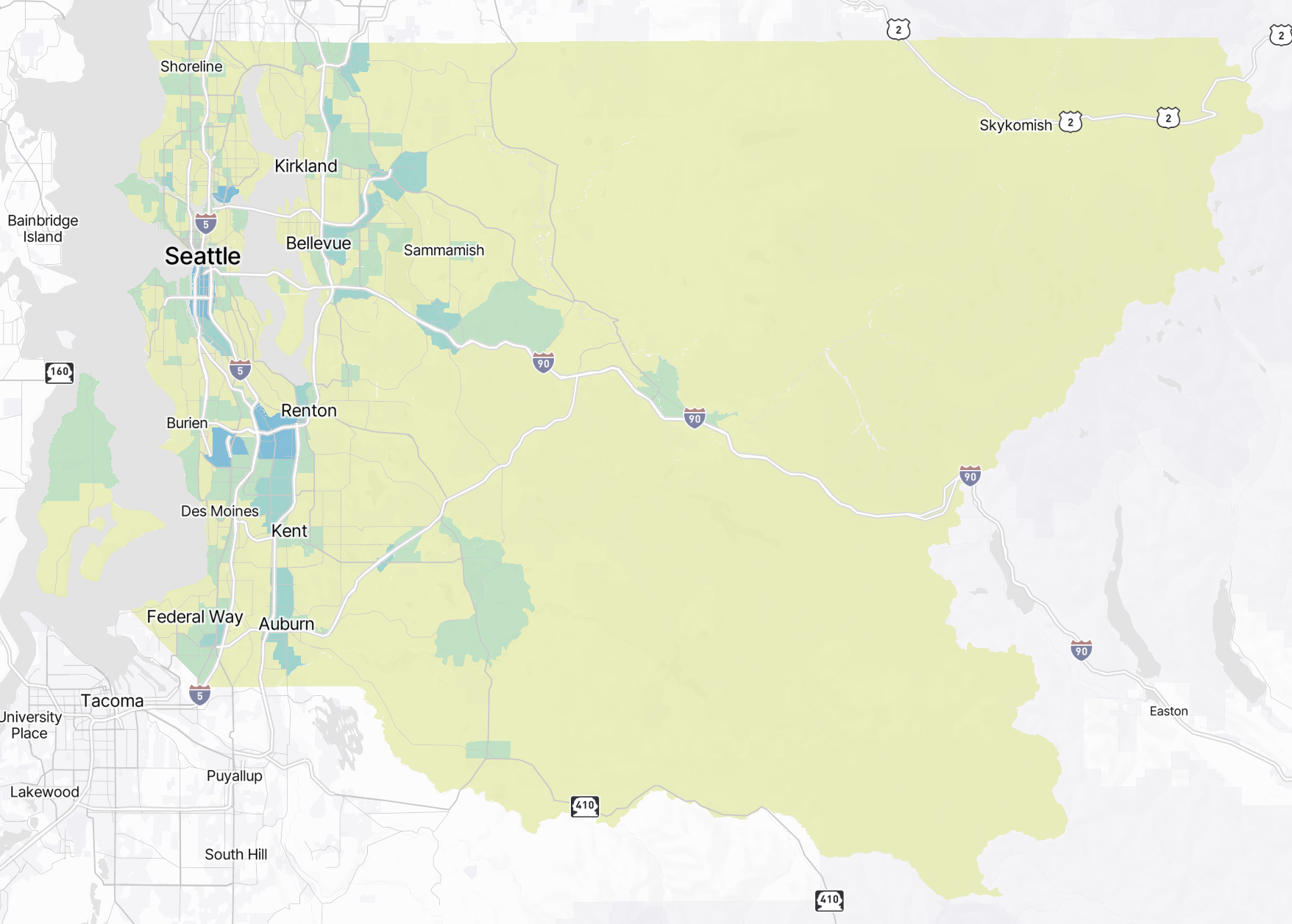
Map Visualization
Understanding Map Visualizations
This section guides you through interpreting the spatial distribution of travel data plotted on an interactive map, providing geographical context to travel behavior insights.
Features of Map Visualization
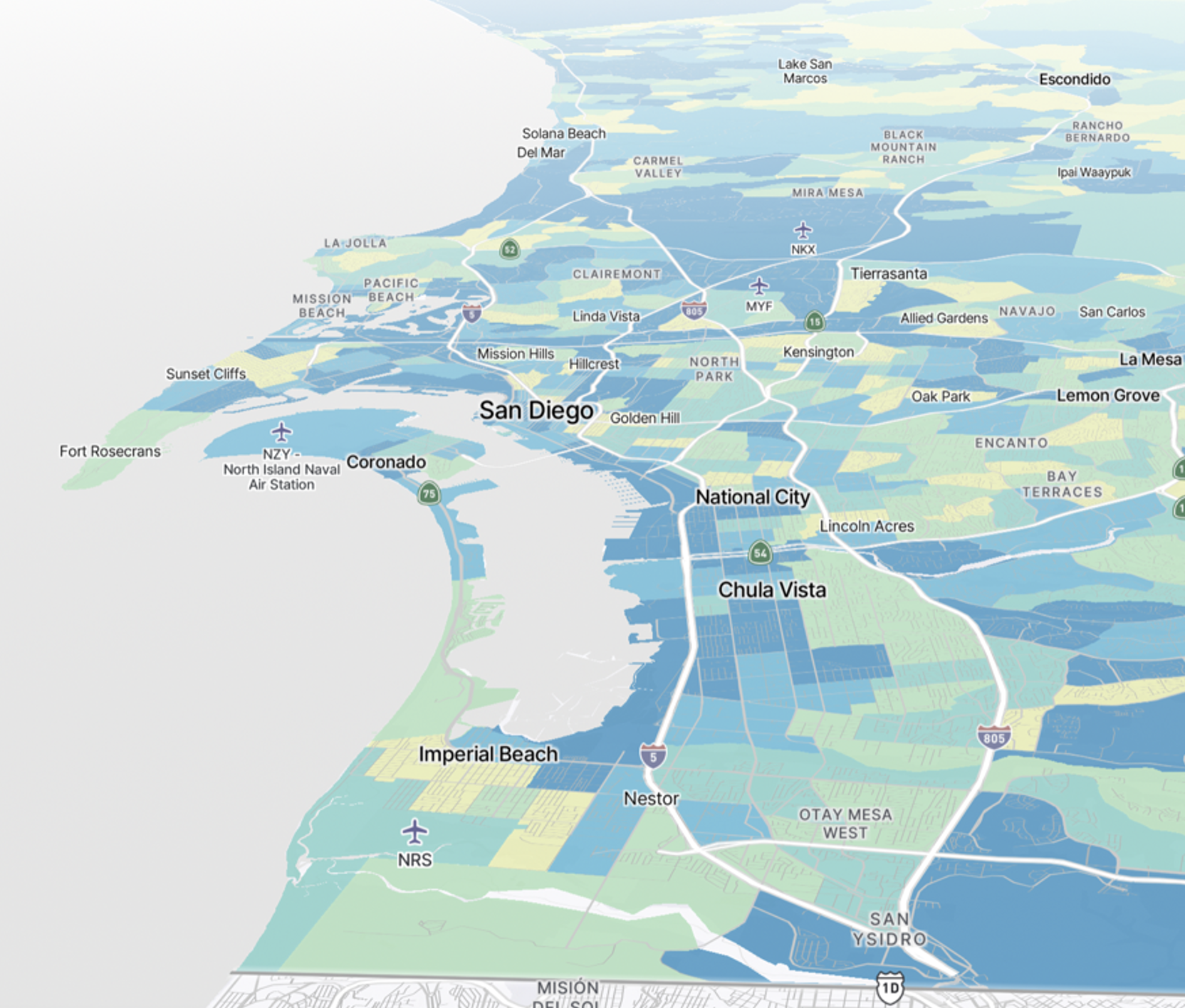
Explore the interactive features of the map, allowing you to zoom in, pan, and click on areas of focus for detailed information. Understand how information about these areas is represented on the map, with each indicating specific aspects of travel behavior.
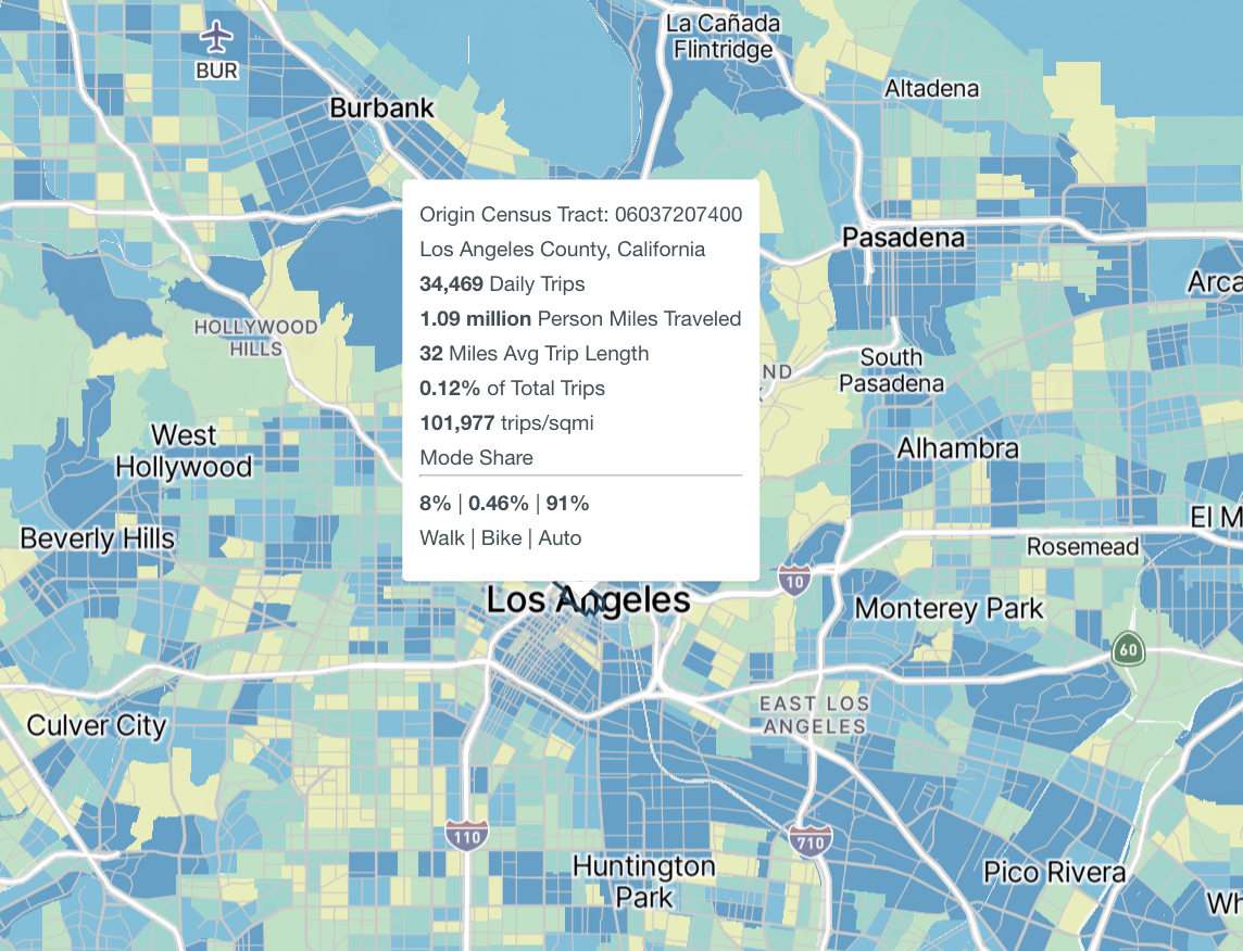
Hover Metrics
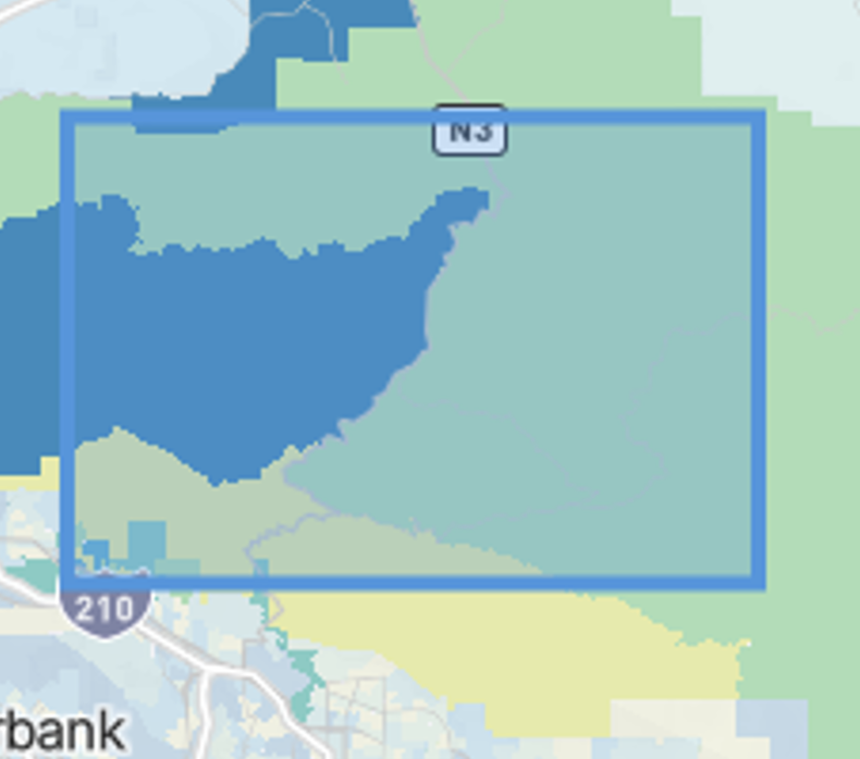
Hovering over different areas on the map will reveal information about the area in question. Hovering over the map will reveal high level metrics and mode share breakdowns for the selected area.
Map Options
Several map options, including adjusting the zoom level, returning the map to its original state, and making selections on the map by drawing directly on the map, are available for use.
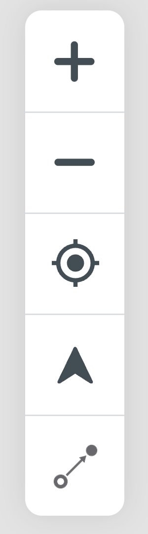
Zoom In/Out
Zoom in or out of the map to view the study area better.

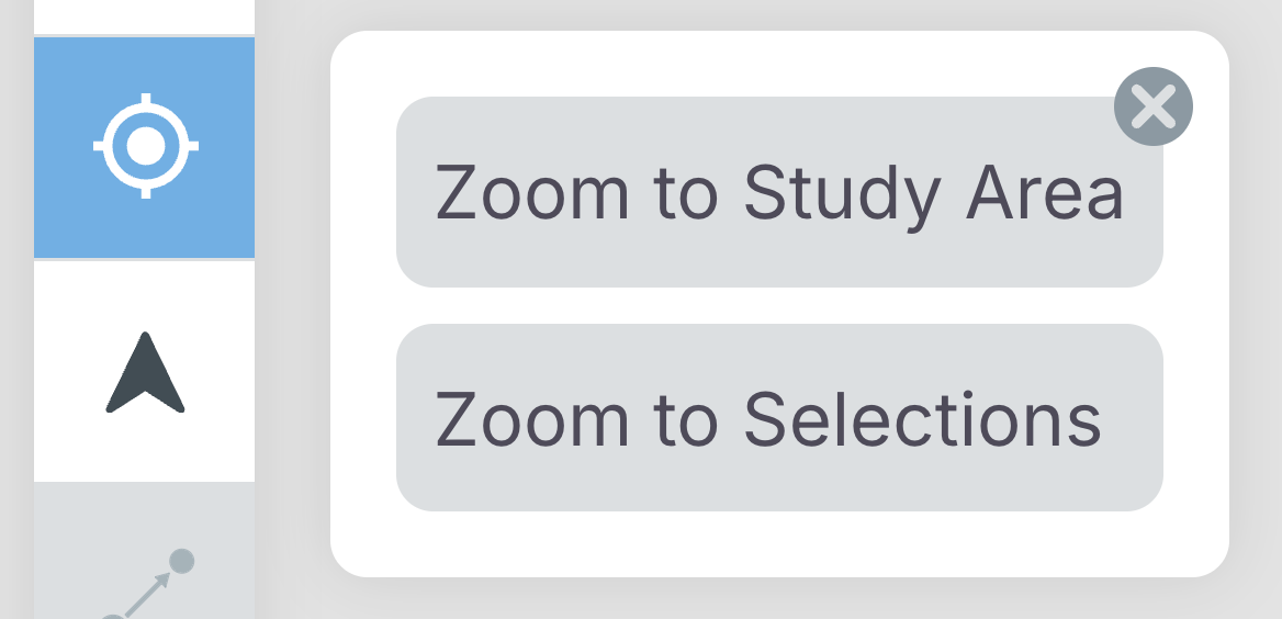
Reset Zoom
Use this to adjust the zoom level to either fit the study area, or a selection that has been made on the map.
Map Orientation
Pan across the map by holding and dragging across your mouse or trackpad while pressing the “ctrl” key.
Return the map to its original position with this button.

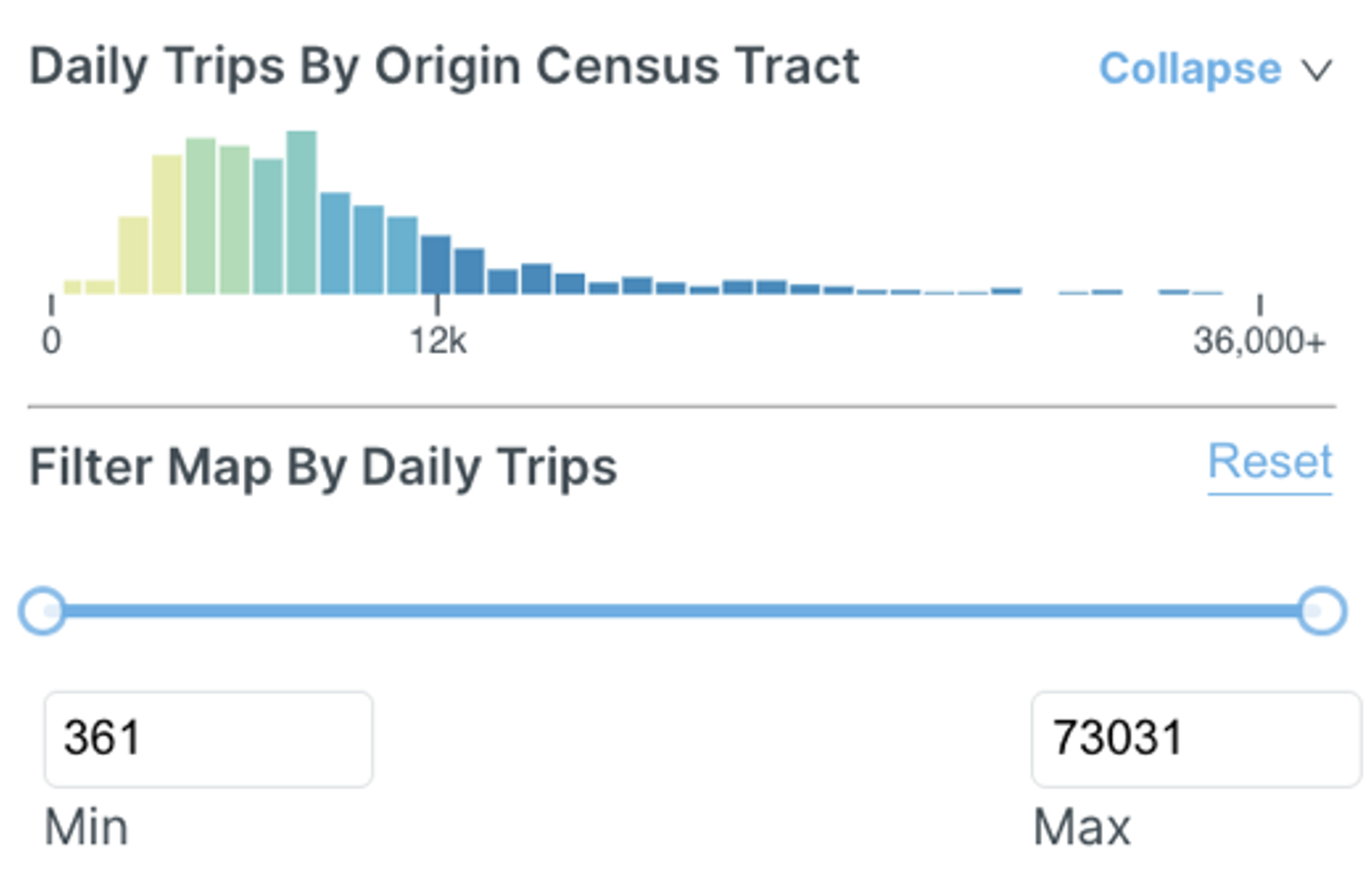
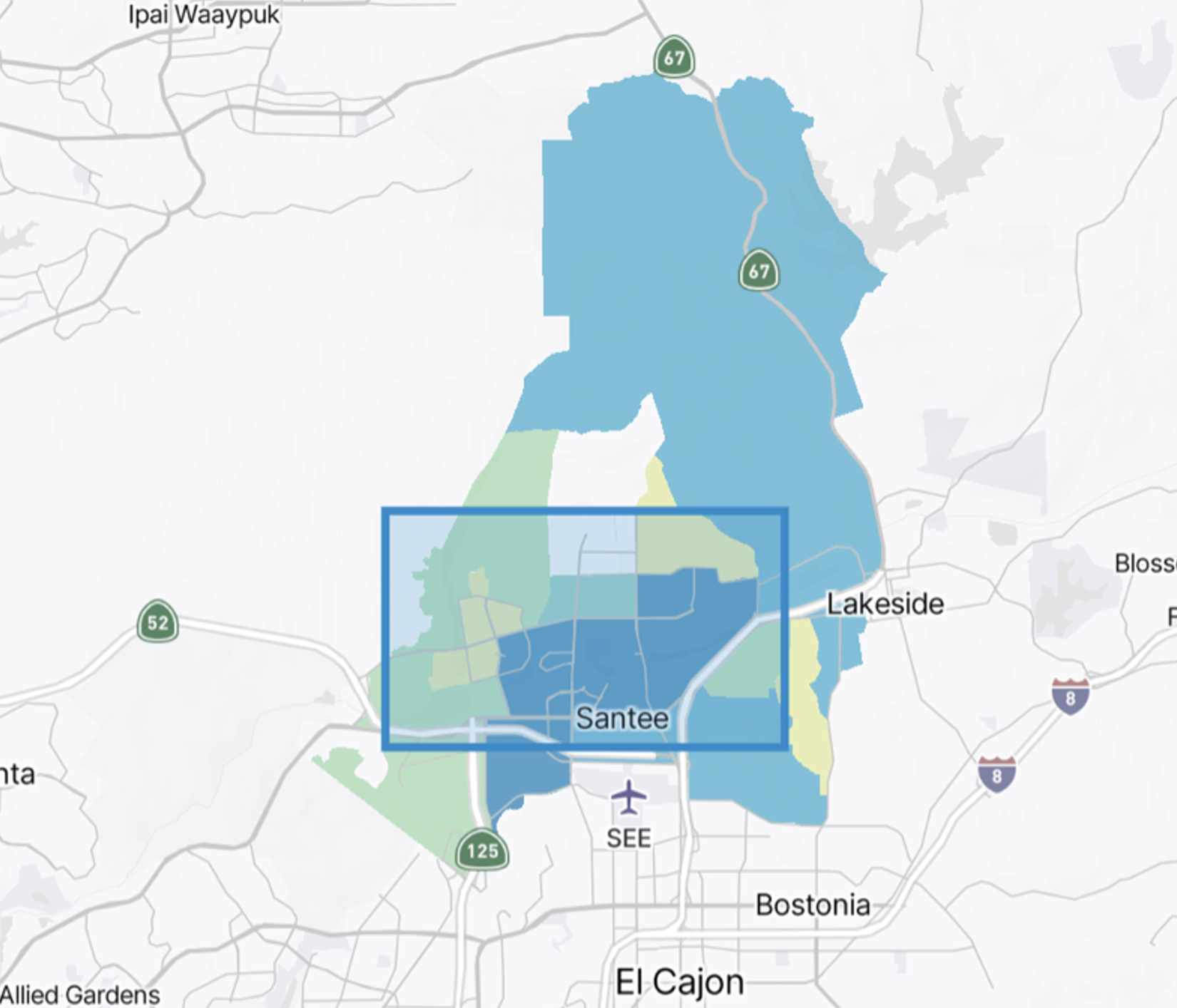
Histogram Legend
The histogram legend categorizes data based on daily trips, total trips, mode share for trips, and other key metrics. The legend also includes a filter that allows users to specify a minimum and maximum number of trips to tailor their study.
Origin and Destination Analysis
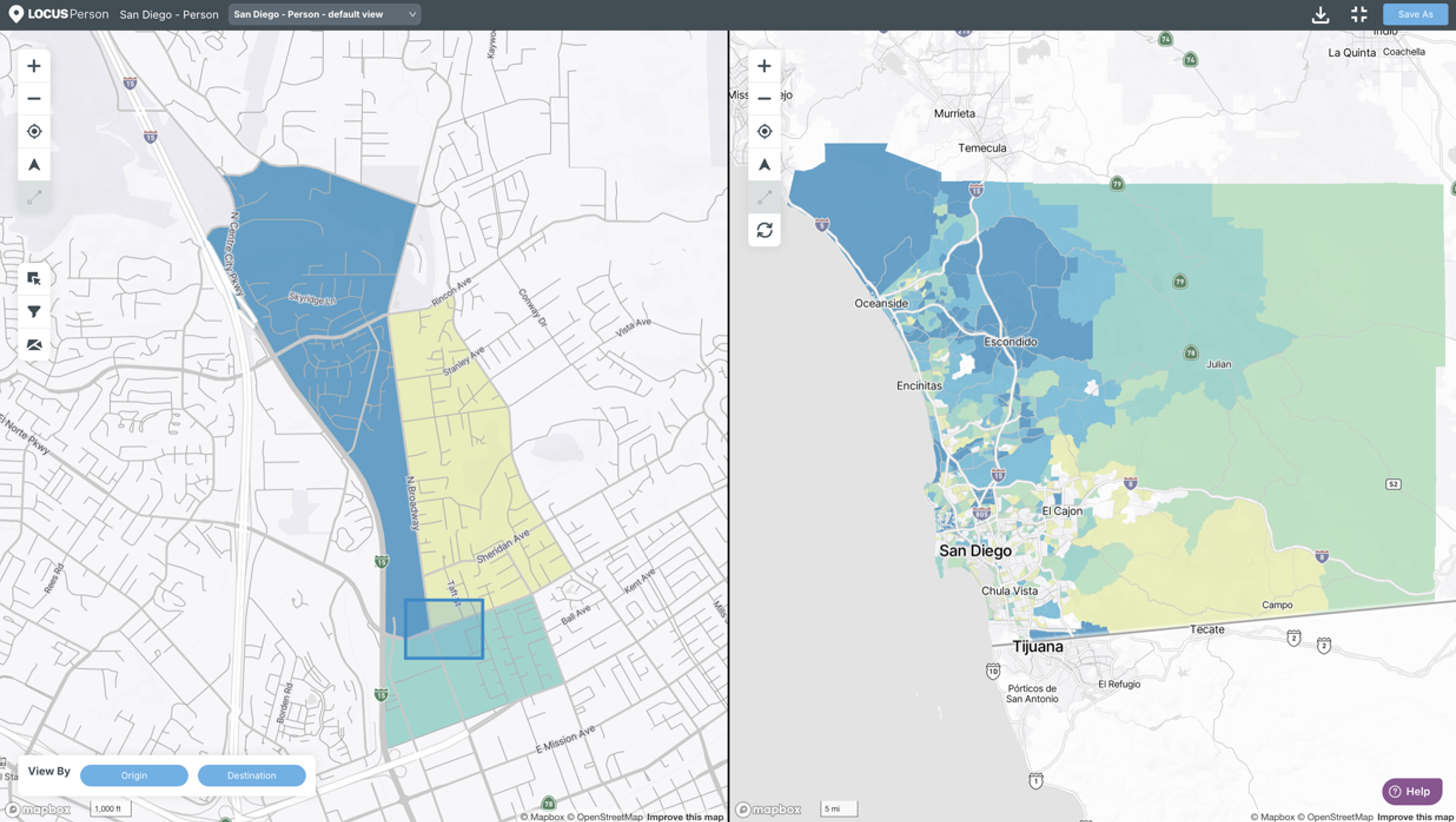
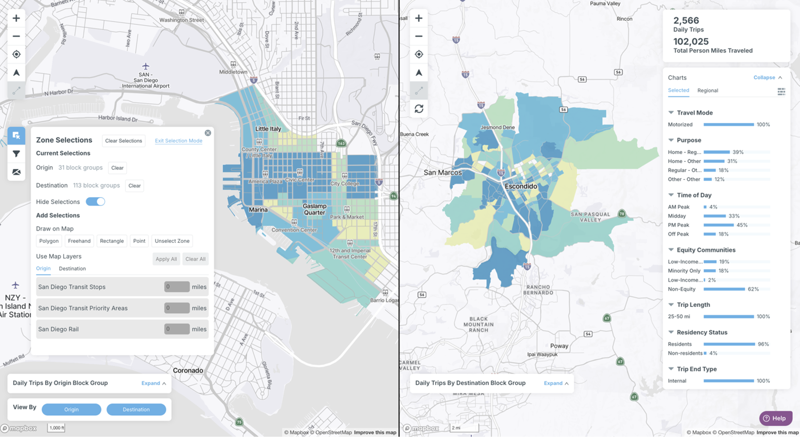
View By Origin and Destination
Toggle to view the map according to trips originating in a certain area, or trips destined to a certain area.

Select both to view origin and destination views in a split screen. In the below example, overlaid components have been hidden to afford more real estate to the maps on the screen.
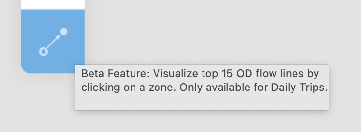
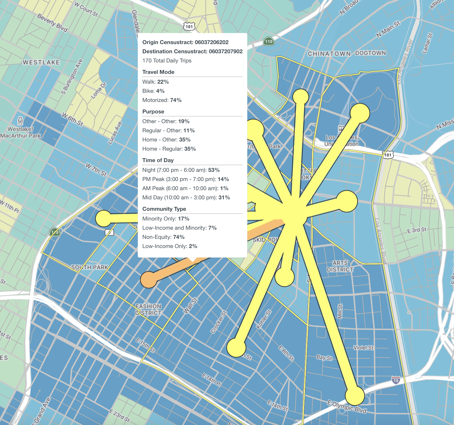
Visualize Top 15 O-D Pair Lines
Origin and destination pairs can also be studied by clicking the origin-destination button in the functional panel to study top origin and destination pairs between selected areas.
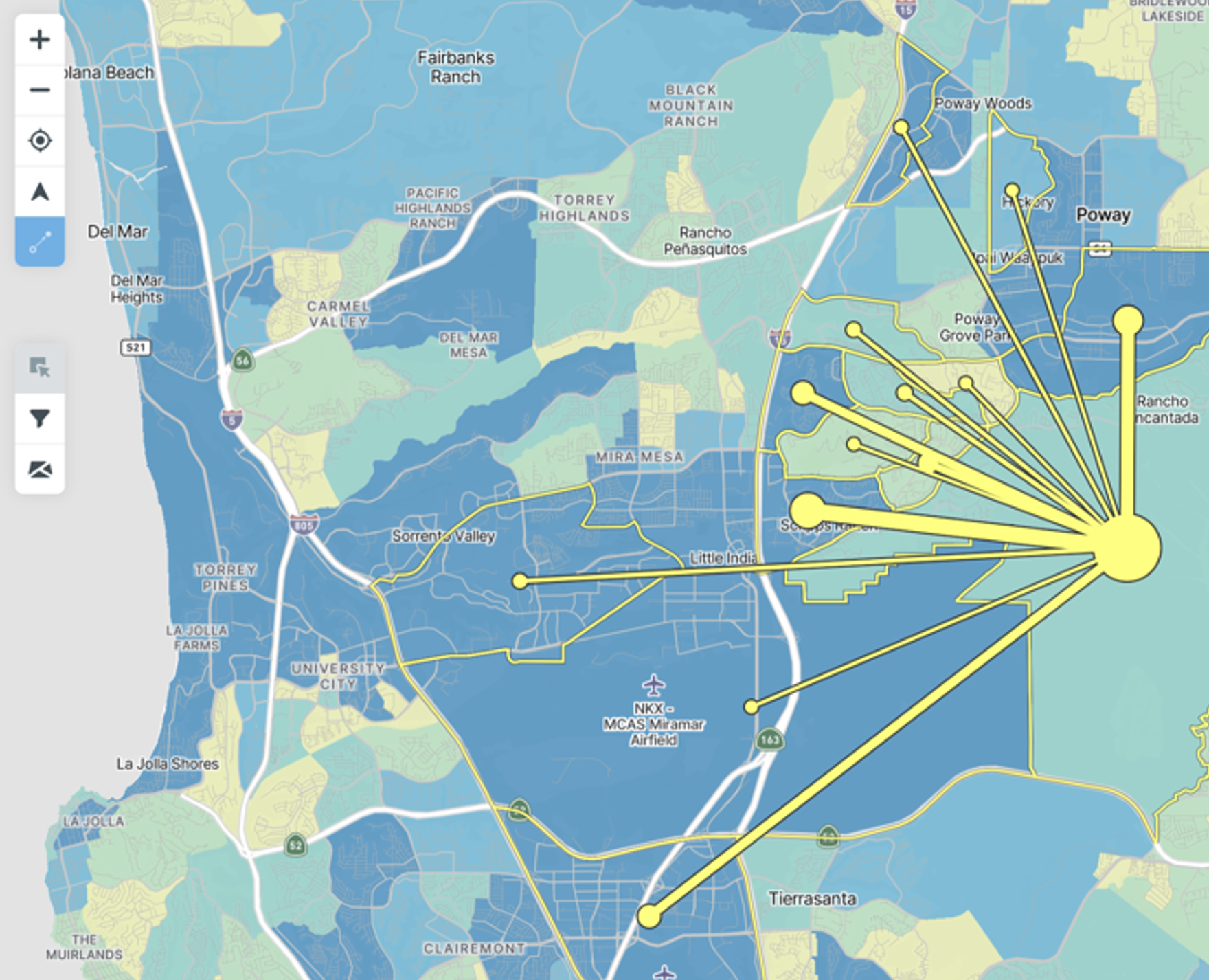
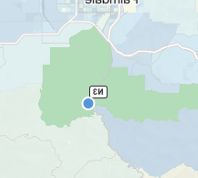
Hover over zones to view metrics specific to the area.
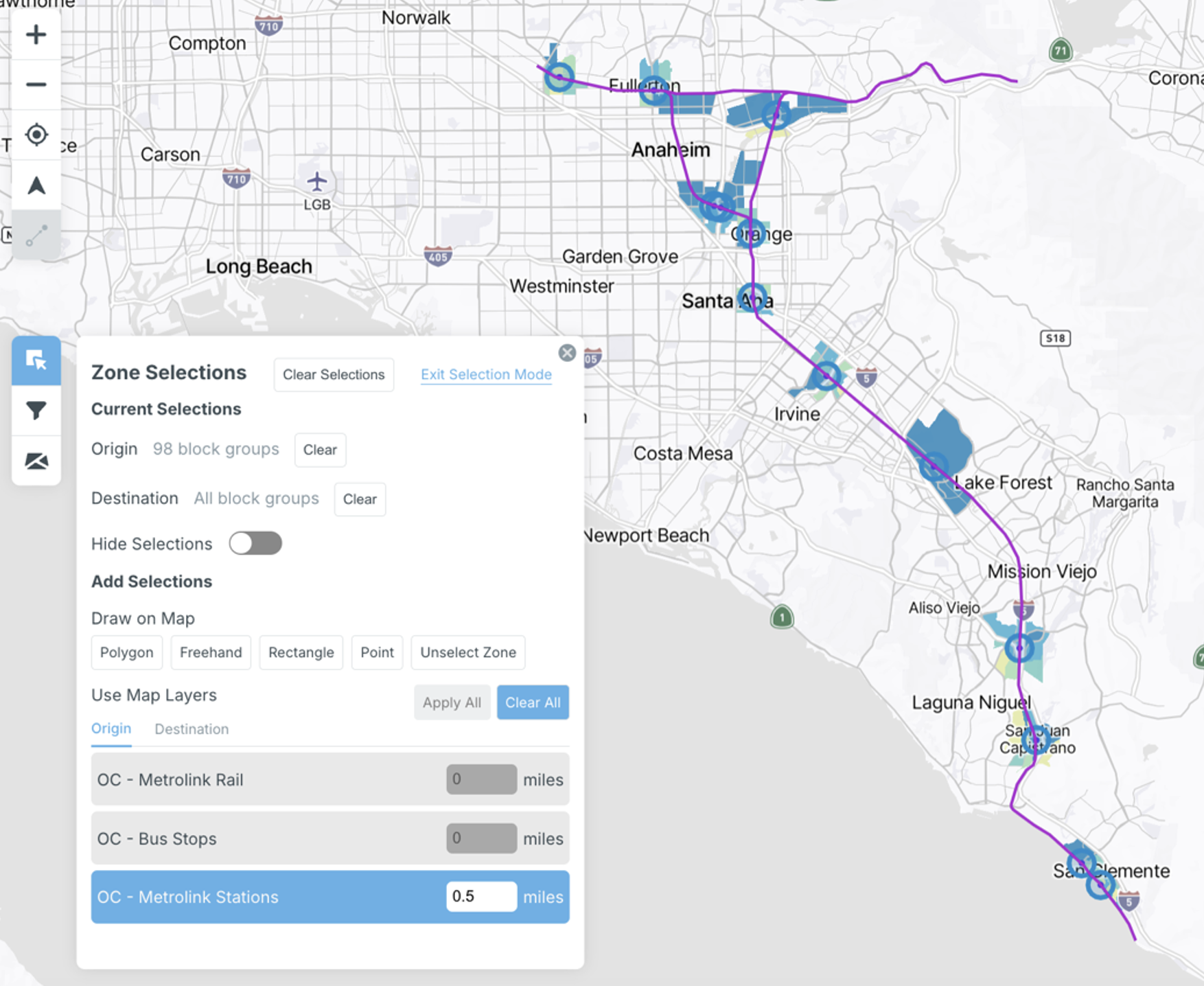
Zone Selections
Make a series of zone selections by drawing directly onto the map or utilizing map layers. “Current Selections” will display the number of origins and/or destinations selected. Geographic resolutions are based on the zone type selected in the data tab (Section 5.2.5).
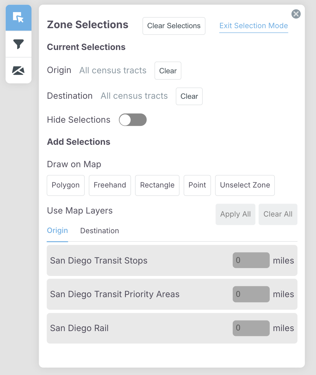
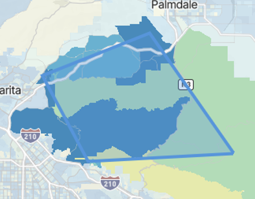
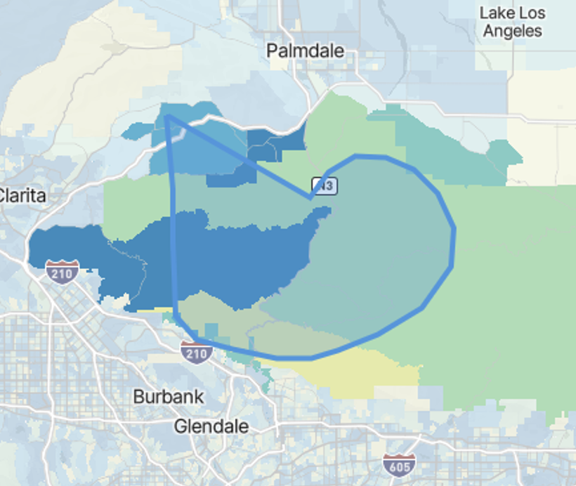
Draw Selections
Make selections on the map by drawing a polygon, freehand, rectangle, or point selection using a mouse or trackpad. For “polygon” selections, press “enter” once you are satisfied with your selection.
Polygon
Freehand
Rectangle
Point
Selections can also be made for both origins and destinations to examine travel between specific areas.
Use the “hide selections” toggle to hide the shape drawn on the map.

Use the “Unselect Zone” button to exclude certain areas from your drawn shape and further customize your selection.
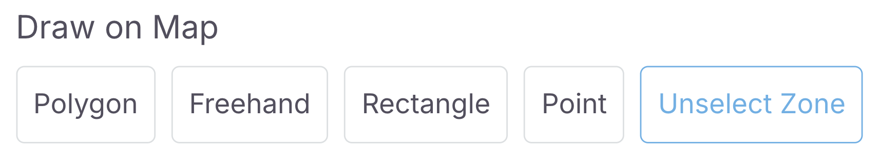
Click on the areas you wish to unselect.
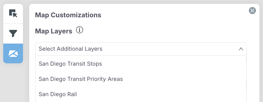
Use Map Layers
During project setup, users can upload map layers for additional analysis. These layers can be made visible in the “Map Customizations” panel (more information on this can be found in a subsequent section). Map layers can also be uploaded after project creation, by choosing between layers uploaded by you and map layers preloaded into the system.
Once a map layer has been selected, users can apply a buffer in miles for a particular map layer to select the zones that fall within the radius and conduct additional analysis.
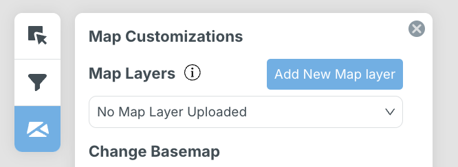
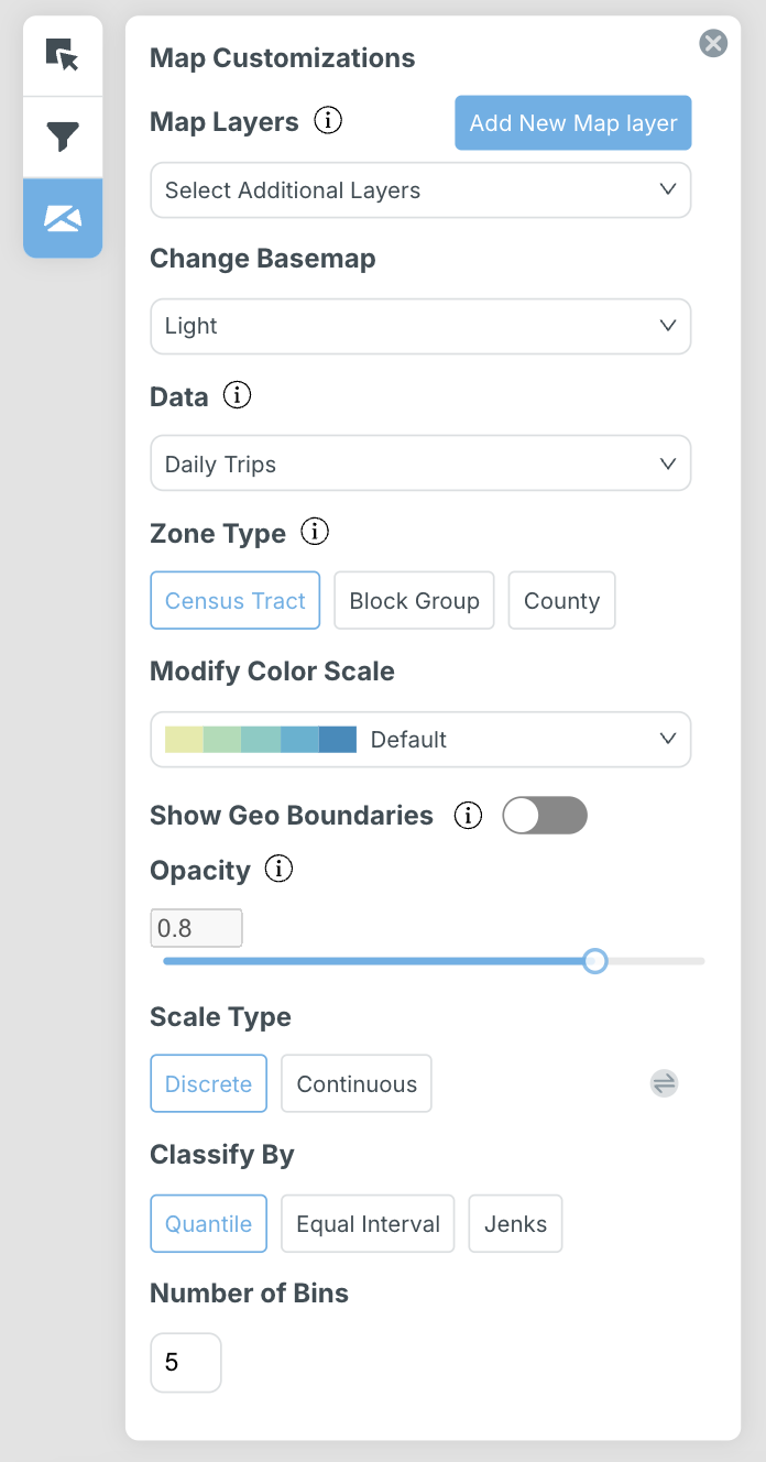
Map Customizations
Overlaying Custom Map Layers
Enhance your analysis by uploading custom map layers, overlaying additional geographical information for a comprehensive understanding. Users can upload custom map layers, overlaying additional geographical information for in-depth analysis. This feature enhances the tool's versatility, enabling planners to incorporate external data for a comprehensive understanding.
Map layers can be further customized by assigning color, size, and opacity, and can be hidden if needed.
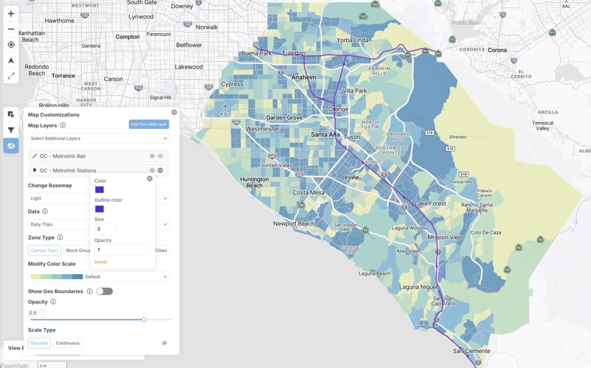
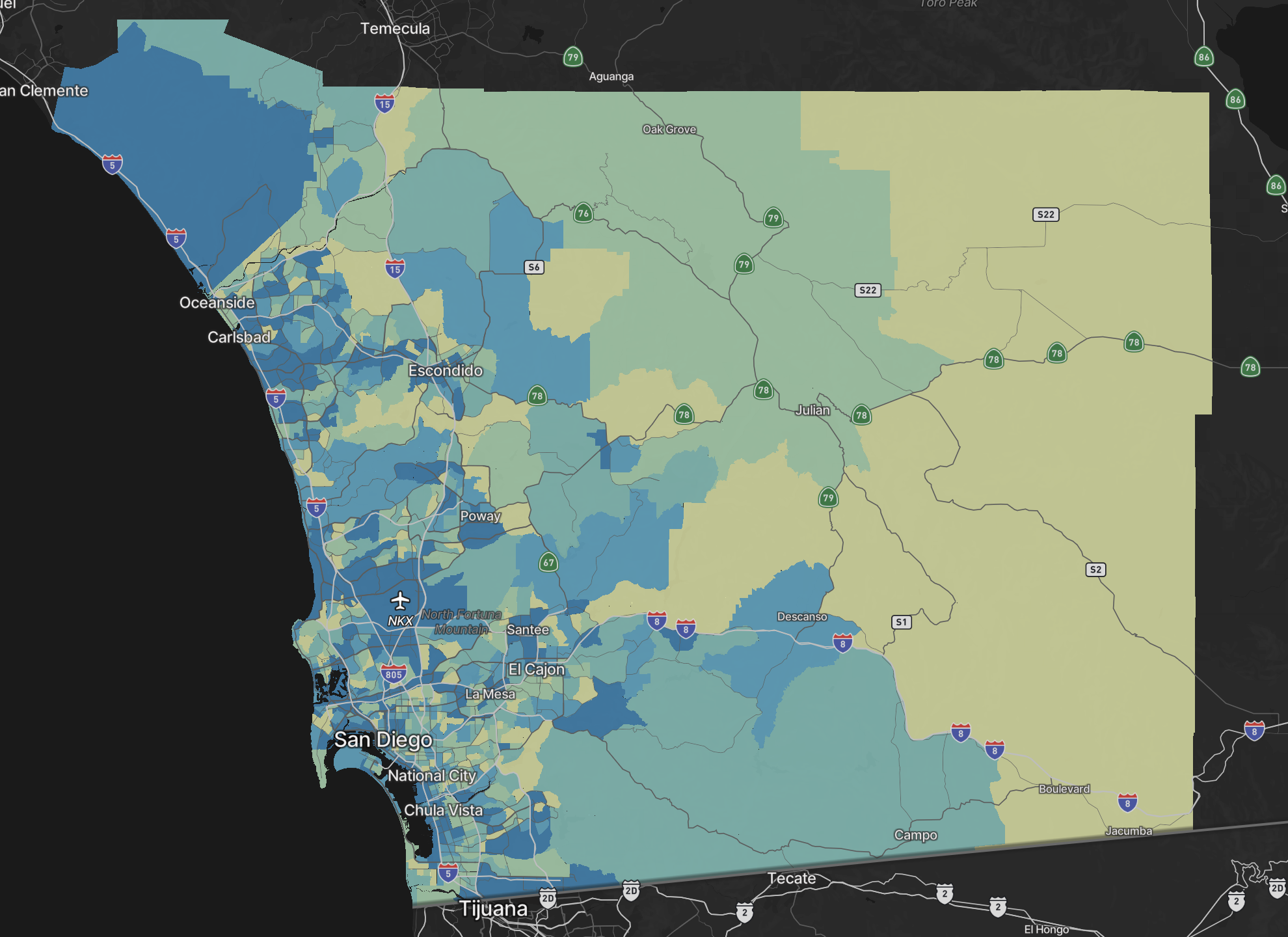
Change Basemap
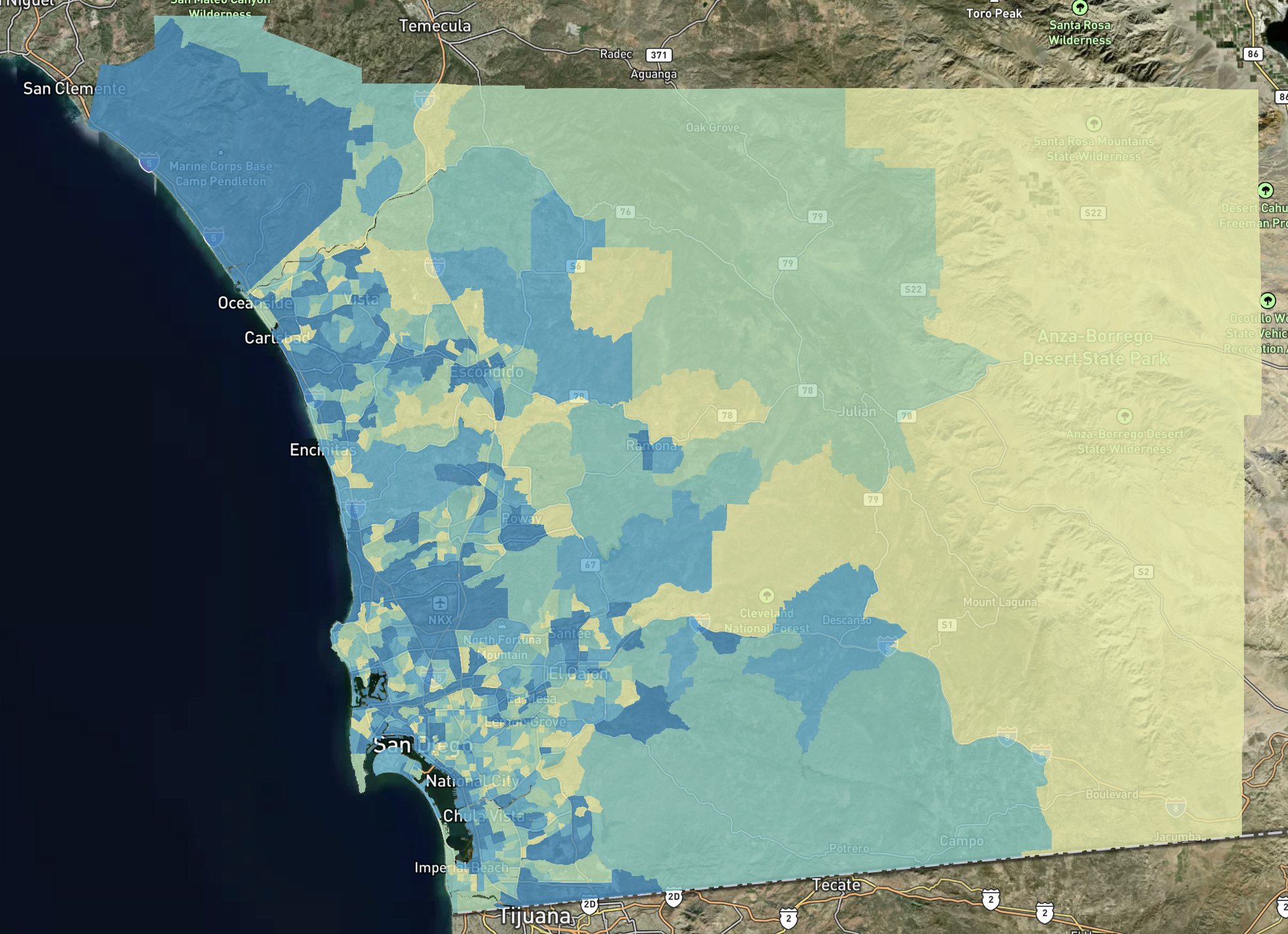
Edit your display preferences by changing the base map from light to dark or satellite.
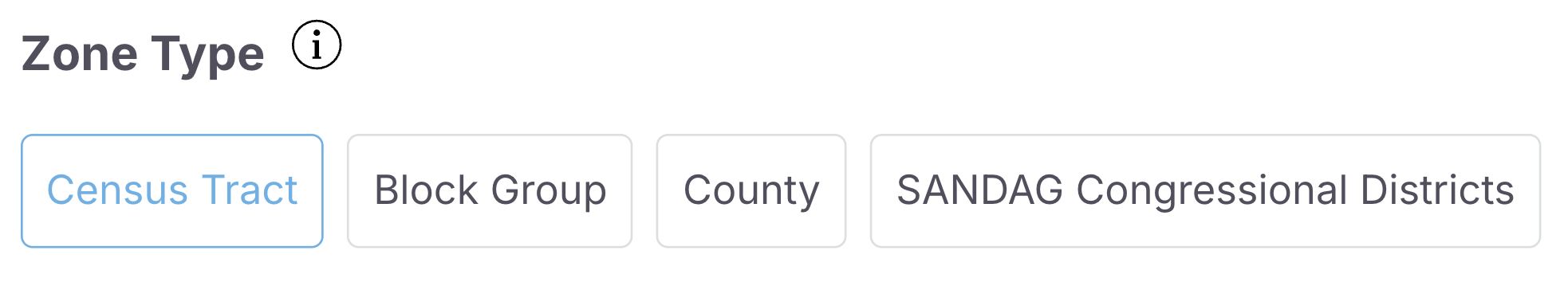
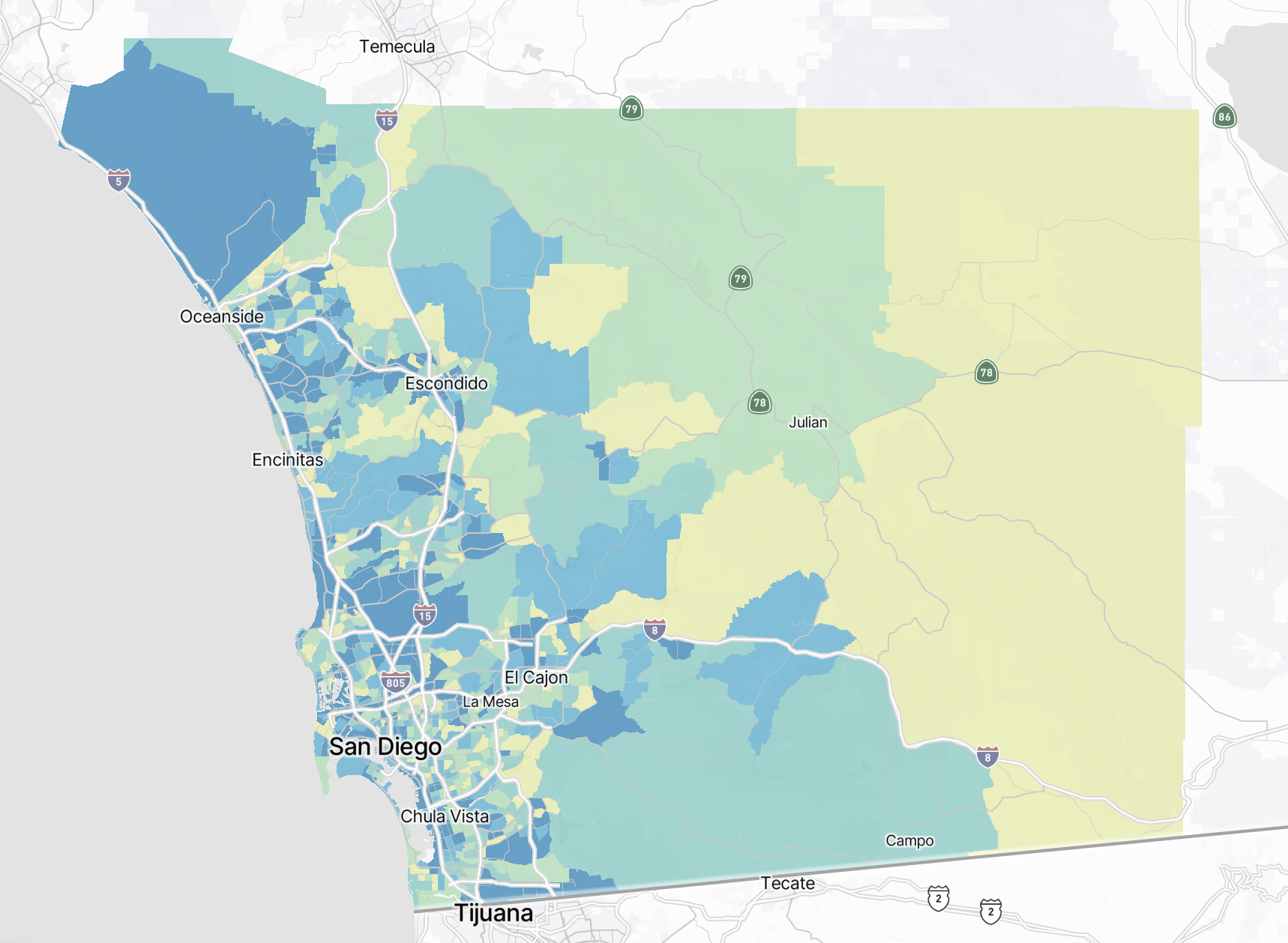
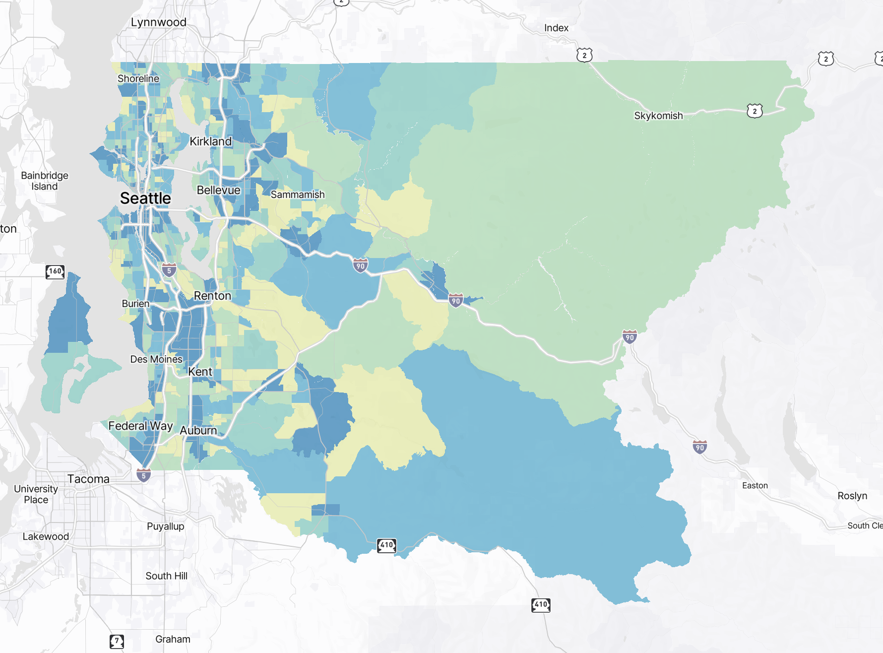
Zone Type
The zone type visualized on the map can also be changed. Options include block groups, census tracts, and counties. If you have uploaded a custom zone system, it will also show up here. When a custom zone is selected, only trips beginning and ending within the custom zone are displayed.
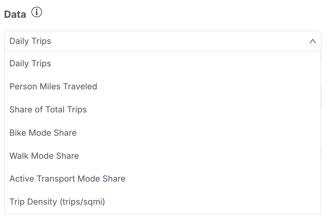
Data Options
The data displayed on the map can be modified from the default setting of total daily trips to view results in relation to other metrics. Dropdown options include daily trips, person miles traveled, the shares of total, bike, walk, and all active transportation trips, and trip density (calculated as the total number of daily trips per square mile of the area).
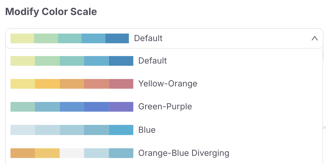
Color Scale
The color scale customization options allow you to visualize the map according to your personal preferences. Modify the colors of the scale by selecting from a dropdown.
Toggle Geographical Boundaries
This feature can be used to show or hide the geographical boundaries of zones.

This can be useful for users who want to view zone boundaries outside of their selection.

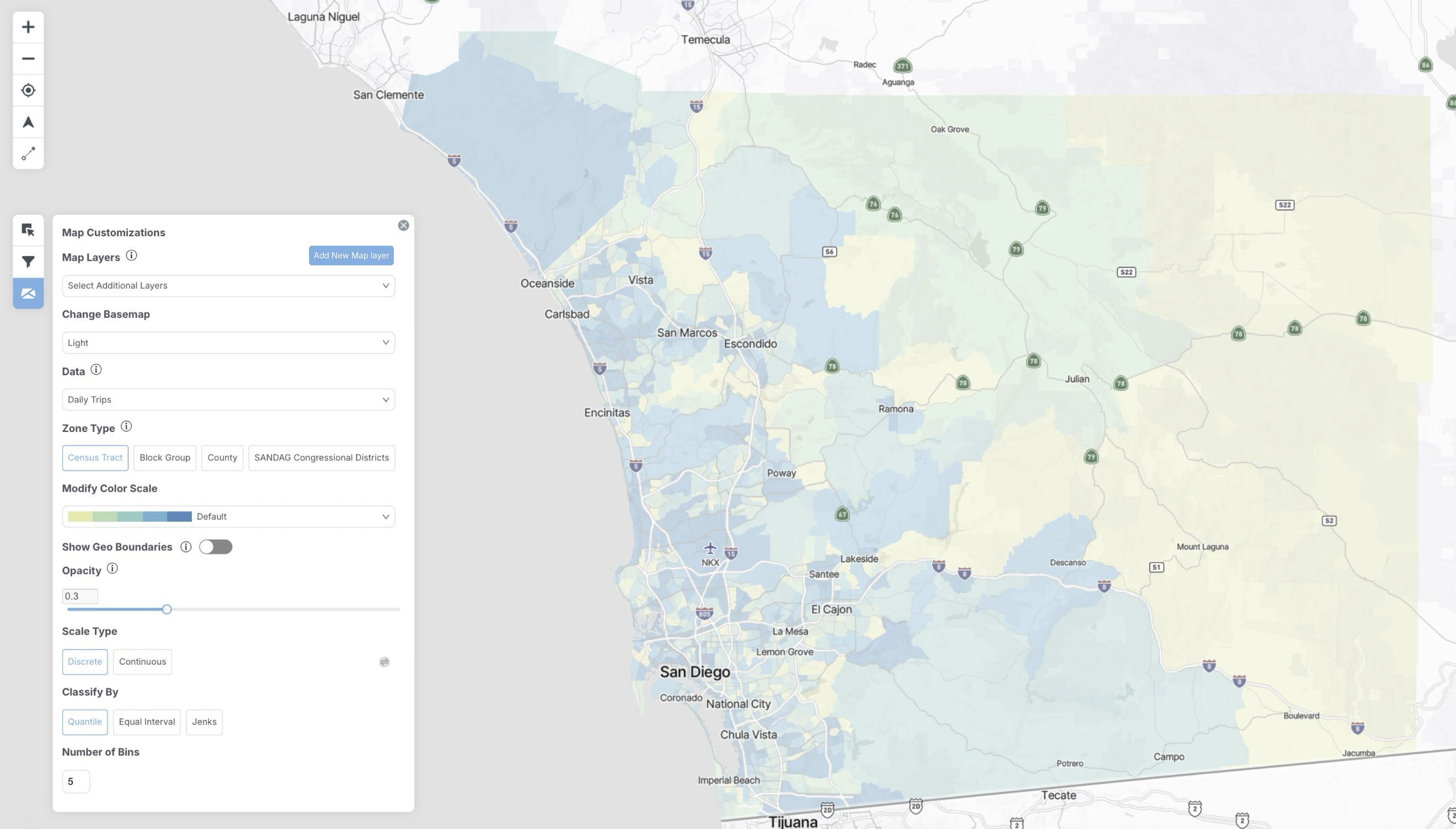
Opacity Slider
The opacity for the polygons containing the geographies can also be modified. This can be especially useful when the map is being viewed in satellite mode to study topographical aspects of an area more closely.
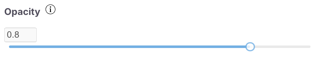
Modify how opaque you would like these polygons to be to customize your map to your preferences.
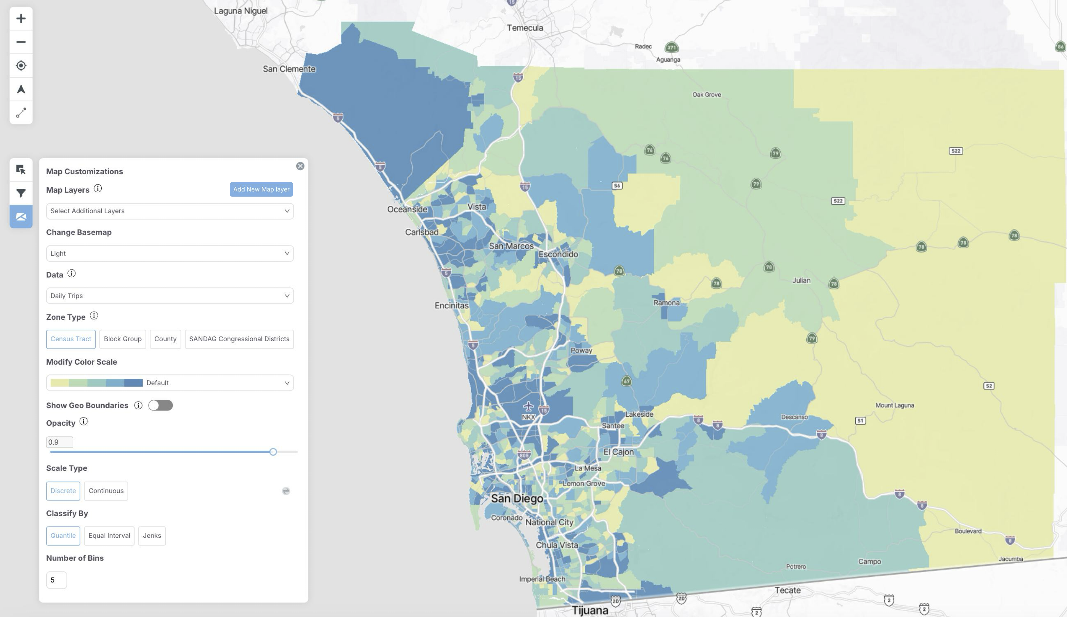
Scale Type
Define your scale as discrete or continuous.

Discrete: Contains numeric data that have a finite number of possible values and can only be whole numbers.
Continuous: Uses an unclassified approach to visualize numeric data along a continuous color gradient instead of predefined ranges.
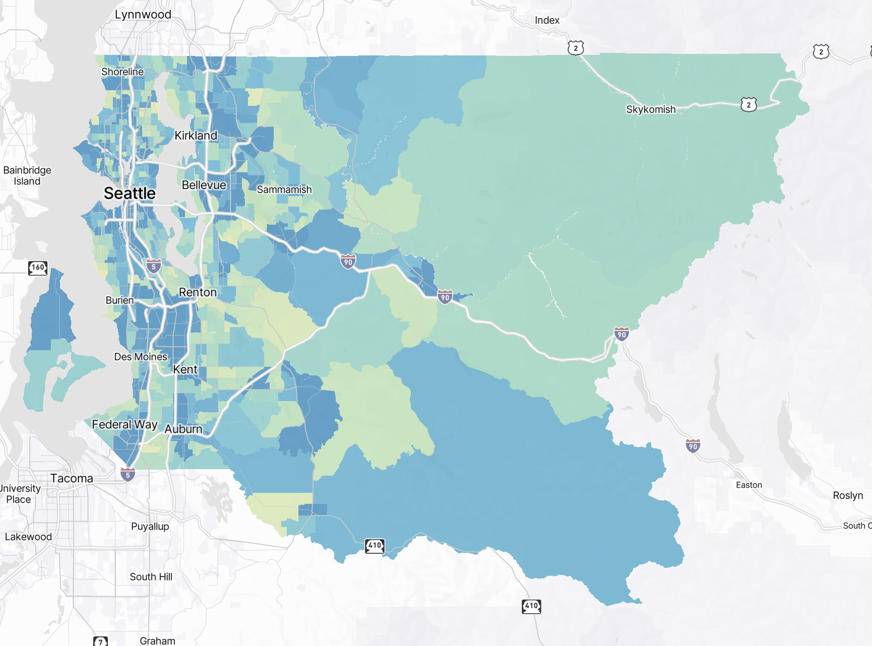
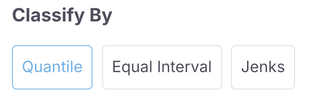
Classification Breaks
Classify your scale according to quantiles, intervals, or jenks.
Quantile: In a quantile classification, each class contains an equal number of features; this classification is useful to visualize linearly distributed data.
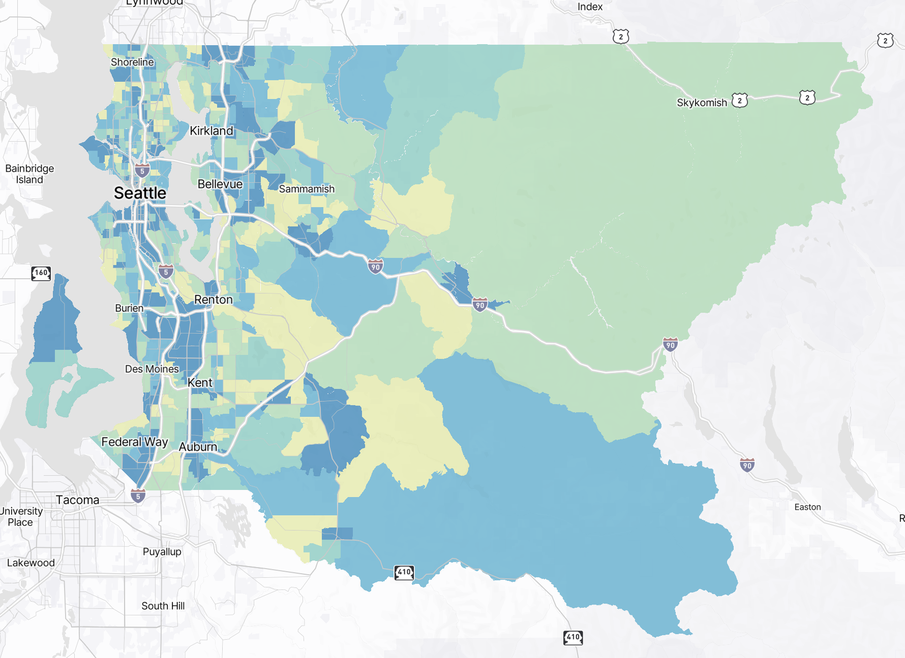
Intervals: In an interval classification, class breaks are based on class intervals that have a geometric series.
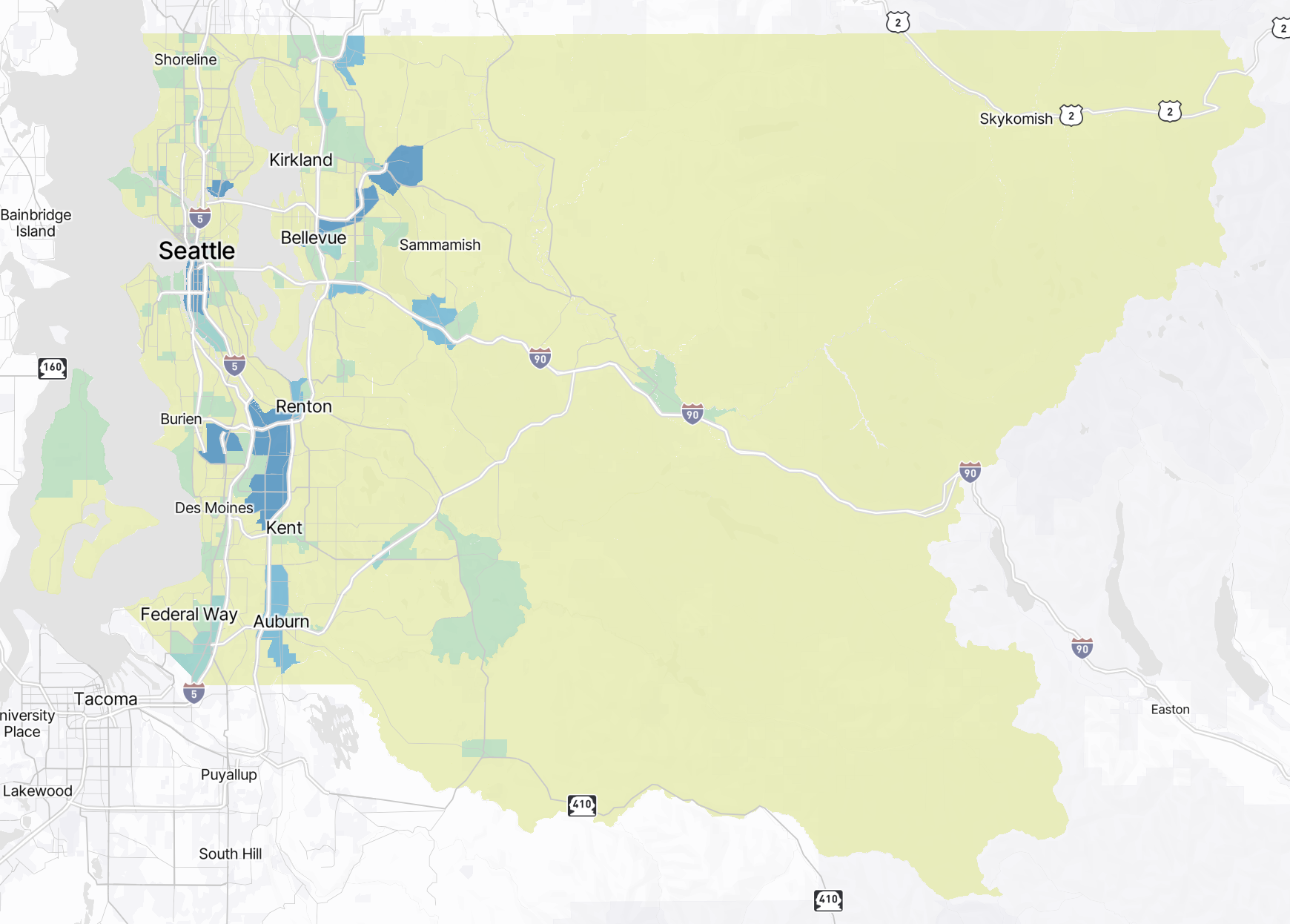
Jenks: With jenks, classes are broken according to natural groupings that are inherent to the data.
Number of Bins
Choose the number of bins for your color scale (maximum of 5)