Dashboard Overview
This section provides a comprehensive overview of the main components, functionalities, and visual elements that make up the dashboard interface of LOCUS Truck.
Main Components
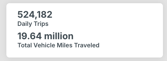
High Level Metrics
High-level dashboard metrics about a specified study area include total vehicle trips within the region and total daily vehicle miles travelled.
Filter Selections
The filter selections form the input side of the product and can be found to the left of the map on the dashboard. These allow you to tailor the data analysis to your specific needs.
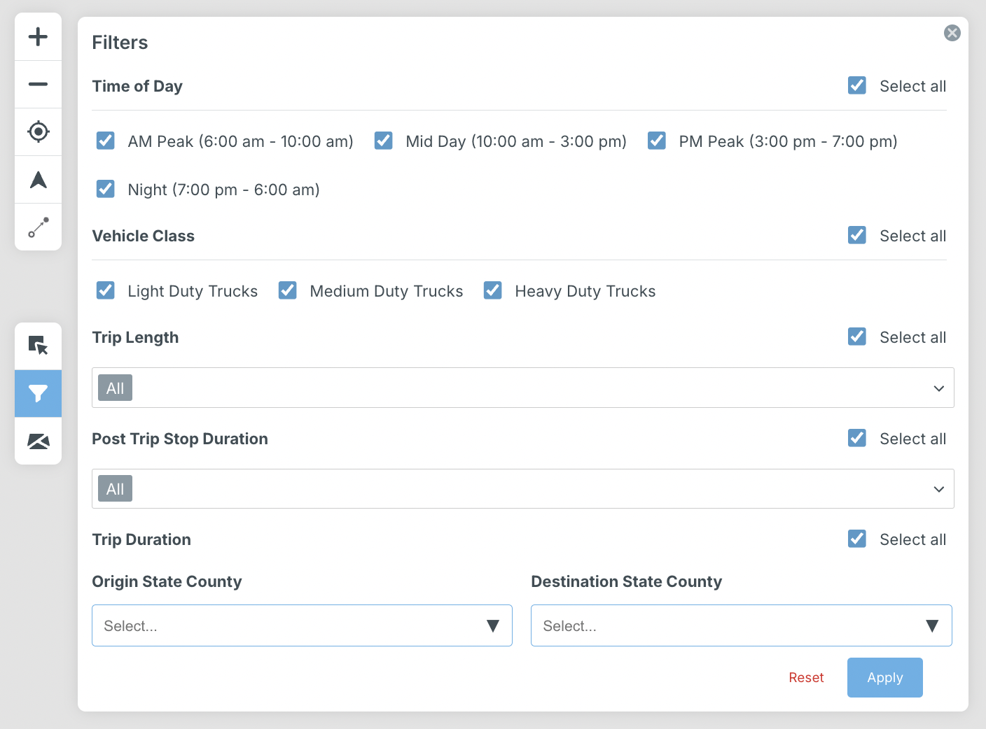
You can filter data based on study period, community type, time of day, vehicle classification, trip length, post trip stop duration, trip duration, vocation, industry, trip end type, origin state county, and destination state county.
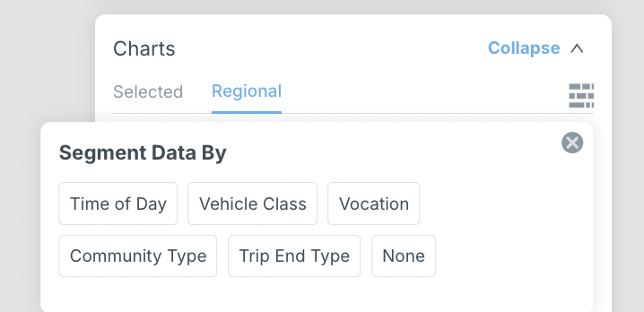
Chart Outputs
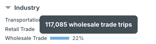
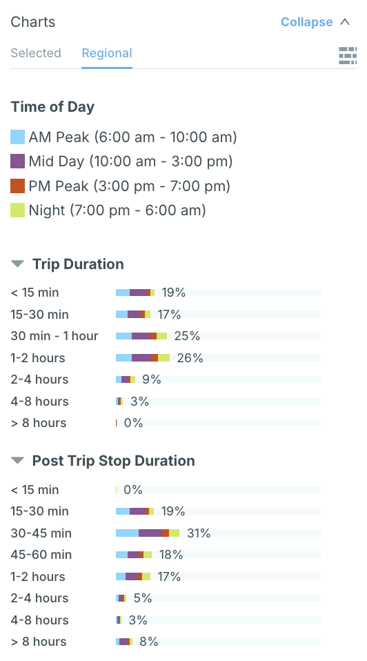
Chart outputs are visualizations of data that dynamically update based on your filter selections. Explore travel behavior data through insightful charts that represent distributions and metrics across different travel attributes, including vehicle class, time of day, vocation, and other parameters.
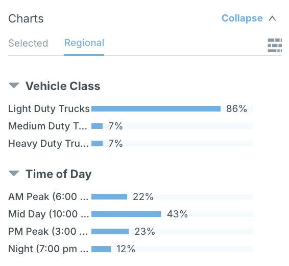
The charts display percent values by default, and hovering over the charts yields precise trip information.
The “Charts” panel is collapsible. This panel reveals metrics on either a regional level, or on a geographic selection level (i.e., metrics that pertain to a particular area selected on the map). The filters apply to both regional and selected panels. These charts can also be segmented further to reveal relational insights.
When a parameter is selected, such as “Time of Day” in the below example, the charts are partitioned according to time of day, with each category corresponding to a different label as shown in the legend.
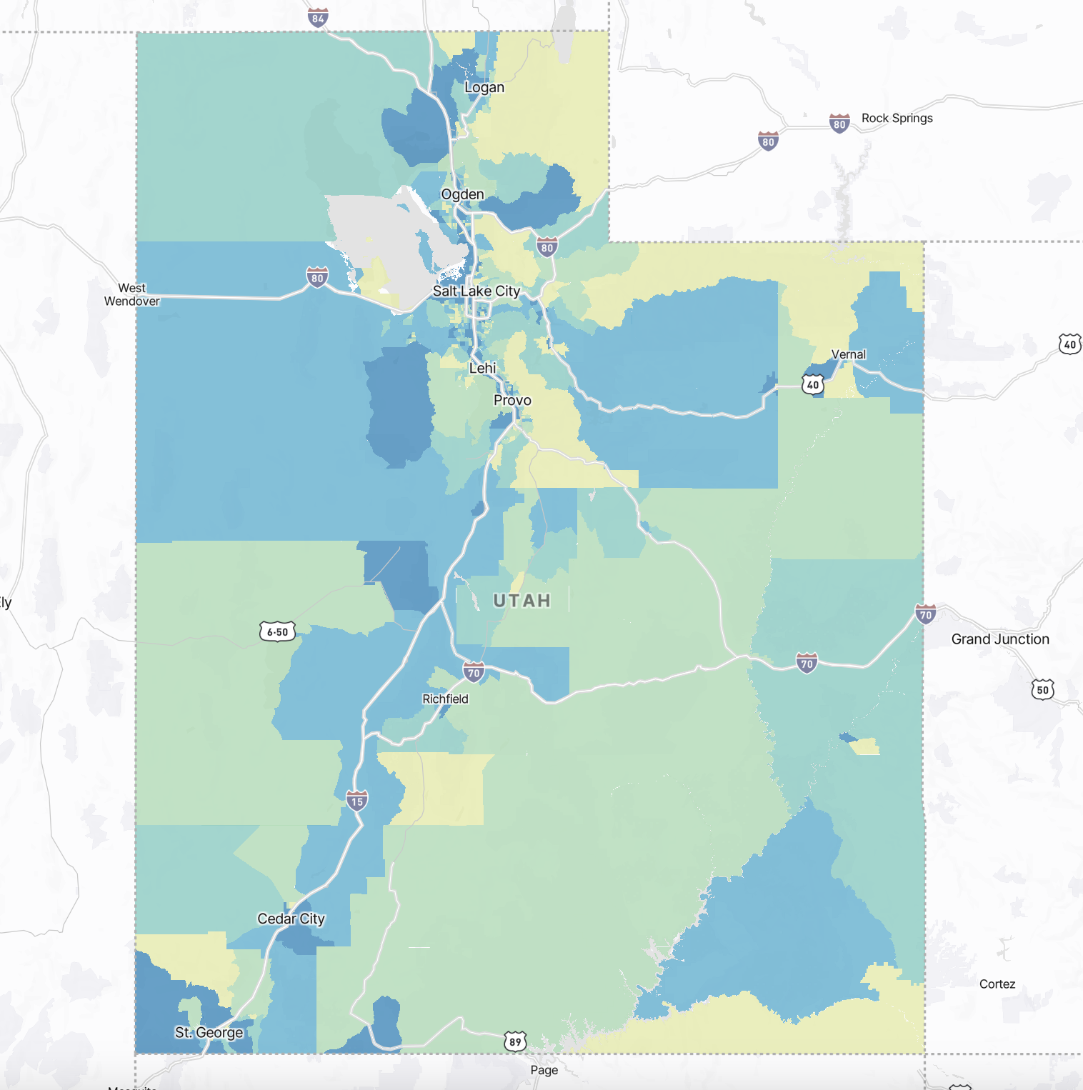
Map Visualization
The filter selections form the input side of the product and can be found to the left of the map on the dashboard. These allow you to tailor the data analysis to your specific needs.

Data is plotted on an interactive map, providing a geographical perspective to aid in planning decisions.
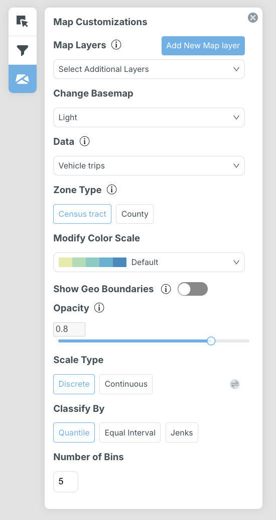
A series of map customizations are available. In the “Map Customizations” tab, users can:
- Add a new map layer
- Select map layers uploaded during the project creation.
- Change the basemap from light (default) to dark or satellite view.
- Modify the metric visualized on the map based on the selection made in the “Data” dropdown, with options including vehicle trips, vehicle miles traveled, trip share, and trip density.
- Edit the geospatial resolution of the map by changing the zone type.
- Adjust the representation of data points on the map: tailor the color scale, scale type, classification, and number of bins.
- Toggle between showing and hiding geographical boundaries of zones.
- Edit the opacity of zone boundaries.
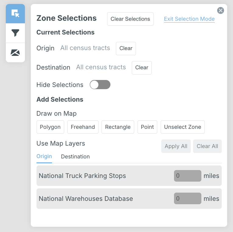
Data can also be filtered by specific block groups and counties, or by drawing directly on the map in the “Zone Selections” tab. Here, map layers can be utilized by assigning origin or destination status, as well as by applying a buffer within a user-defined distance to customize analysis.
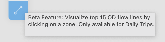
Origin and destination pairs can also be examined by visualizing the top 15 origin and destination pairs between selected areas for daily trips.
Other map options include zooming in or out of the map, resizing the map to fit to the study area, and editing the orientation of the view. For more information about map options, refer to section 5.2.
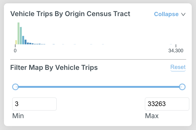
Histogram Legend
Our tool features a histogram legend that serves as a guide for interpreting the visualizations on the dashboard.
Download, Share, and Save Options
Options to download data, share the selected view, minimize the outputs and legend, save an existing view, and create a new view with “Save As” can be found in the top left of the dashboard in the navigation pane.

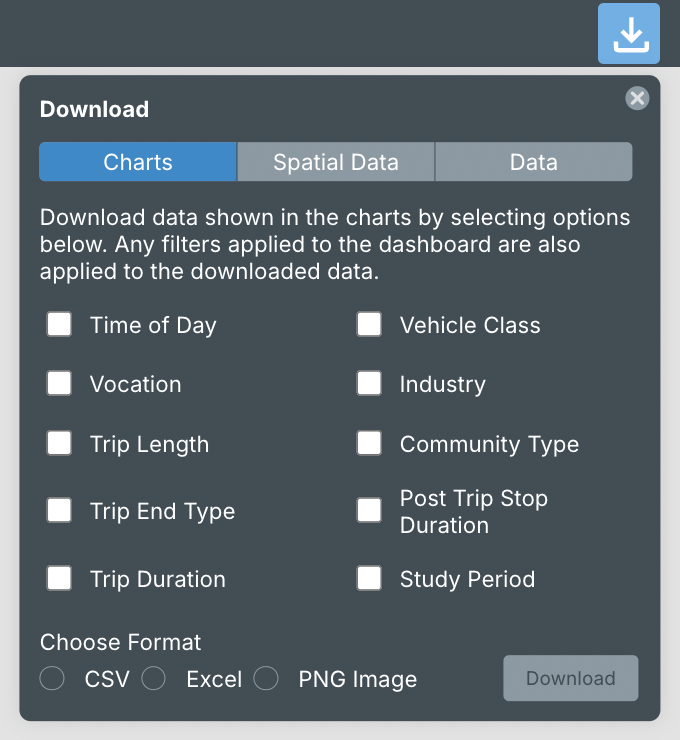
Download Data
Download data in multiple formats using the “download” button. Information for charts, the map, and dashboard data can be downloaded.
Charts
Select one or multiple charts to export in CSV, Excel, or PNG image format.
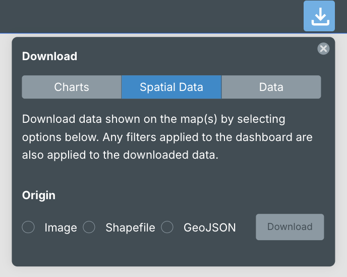
Map
Download the origin or destination map and associated data in a zipped shapefile or GeoJSON format to conduct data analyses with external mapping program. If a user wishes to download both origin and destination data, both maps must be selected prior to downloading the information.
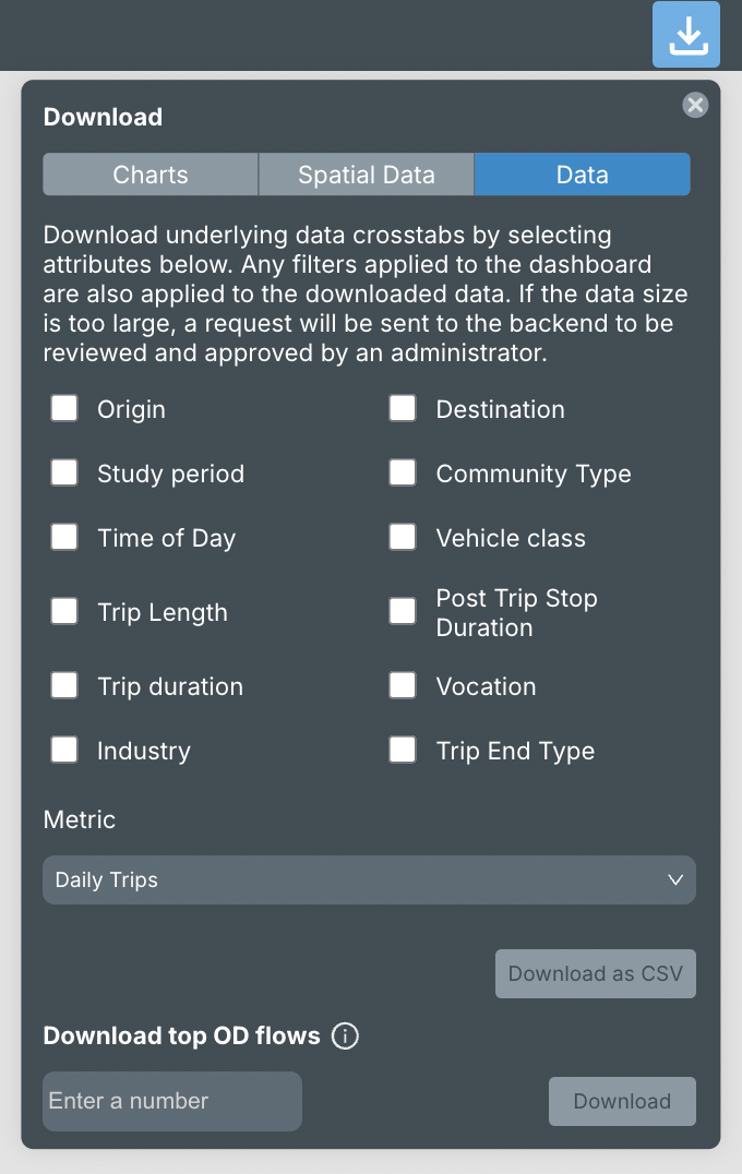
Data
Export cross-tabulated data by selecting up to 3 fields to download data for, as well as the metric you wish to explore in relation to this information from the dropdown. If more than 3 attributes are selected, or if both origin and destination attributes are selected, the data request will be reviewed by an administrator before approval. All filters applied on the dashboard are also applied to the downloaded data. Export as a CSV or Excel file. Download up to 5000 top OD flows.
Share
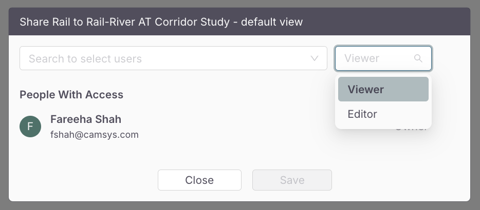
Share a view owned by you with one of multiple users, and assign “Viewer” or “Editor” permissions.
Step 1: Click the “Share” icon on the top right of the dashboard in the navigation pane.

Step 2: Add users and assign permissions. These settings can always be edited in the future.
2.2.3 Save
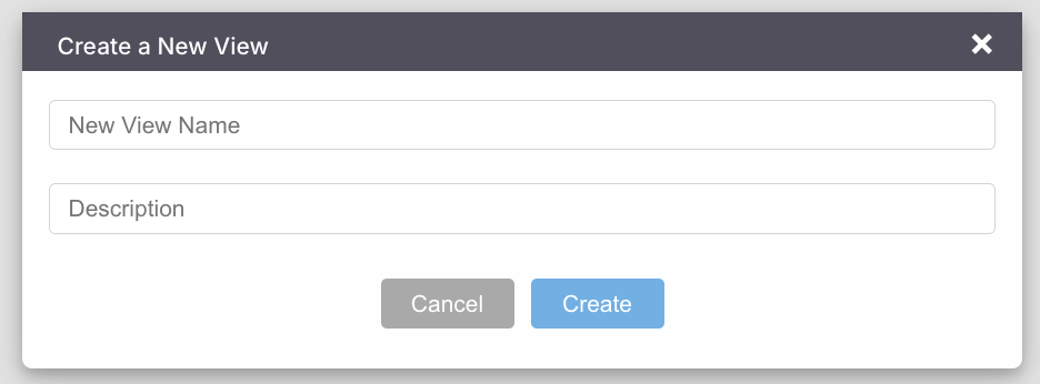
Save an existing view with specific filter selections applied. Click “Save As” to create and save a new version of this view.
Step 1: Click the “Save As” button on the top right of the dashboard in the navigation pane.

Step 2: Enter a view name and a description.
Navigating the Dashboard
The dashboard is designed to be intuitive, with user-friendly navigation. As you explore the various components, you will find interactive elements that respond to your selections, providing real-time updates and insights.